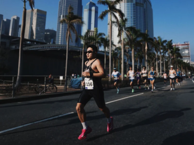
Huang Ji is a product and visual designer who picked up running a few years ago and never stopped, all the way to a 3:24 full marathon. Along the way, he started imagining what a running app could feel like if it were designed purely around delight. He’d never written a line of code, but using AI tools and his design instincts, he shipped Run Receipt, an app that turns your workout stats into a beautifully typeset thermal receipt. We sat down with him to talk about running, building, and the joy of making something small and personal.
Q: Let’s start from the beginning. How did you get into running?
A few years ago I realized my body was heading downhill. I’d been sitting at a desk all day, ordering takeout, barely moving. I gained about five kilos almost overnight and knew I needed a physical habit to pull myself out of it. I started with 30-minute jogs at the gym, maybe 3 or 4 kilometers. It was genuinely hard at first.
The shift happened when I started running outdoors. I’d noticed people running in parks at all hours, mornings and evenings, and one day I went out without headphones, just jogging around a small park near home. There were older folks exercising, people of all ages doing their thing, and something about that communal energy clicked. It felt like a lifestyle, not a workout. I gradually moved all my running outside and started pushing further: 5K, then 10K, then half marathons. My first half marathon left me sick for two days afterward; your immune system just crashes. My first full marathon was even harder. I could barely walk down stairs for three days, practically holding the wall. But your body adapts. Now my full marathon PB is 3 hours 24 minutes, and my half is about 1:29. Two and a half years in, I got lucky and drew a spot in the Tokyo Marathon. Running through streets where the crowd is cheering in every language on earth, that was something else entirely.
These days I train four to five times a week with a coach: two easy aerobic runs, two speed sessions focused on pace capacity, and a long run on the weekend, usually 25 kilometers or more at a relaxed effort, mainly for building cardiopulmonary endurance. Running has become a real discipline for me, not just exercise.
Q: So with all that running, what made you feel like you needed to build your own app?
As a product designer, I interact with apps all day, so I naturally had a picture of what I wanted a running tool to feel like: clean, lightweight, something you pick up and put down with zero friction. I also believe running data is deeply personal. You should be able to share it wherever you want, on any social platform, but the tool itself should stay quiet and focused.
Sharing is a fundamental human impulse, a basic social need. People who have that desire want to express themselves through different forms, not just the same template everyone else uses. I’ve always been drawn to products that are small and beautiful, and I wanted to build something with a strong sense of brand, a distinct visual personality and narrative. As someone who works in product and visual design, I felt like digital products deserve that same kind of identity that you see in good physical branding. So it started as a bigger vision: a running app with its own character, where the sharing experience could feel genuinely different.
Q: Why the receipt format? That’s a pretty unexpected metaphor for running data.
I explored other formats first: route map posters, photos with pace and distance overlaid. Those are well-trodden paths. If I wanted the product to have its own identity, I needed a concept that felt fresh.
I spend a lot of time looking at typefaces, poster layouts, and graphic design in general. A receipt caught my attention because it has this wonderful physicality. It’s a real-world artifact with a very strict typographic structure, but the content is completely mundane. Swapping in running data felt like an interesting tension: the familiar format of a grocery store receipt, but carrying something personal and meaningful. Of course, running data and shopping items have very different structures, so there was real design work in figuring out how splits, heart rate curves, elevation profiles, and pace trends could map onto that format in a way that felt natural rather than forced. It’s not a real piece of paper, but it feels like one. Some users have even asked if they can connect a thermal printer and print them out, and they absolutely can. A 30-yuan printer, connect it, and the receipt image prints right out.
Q: You’d never written code before Run Receipt. How did you actually build it?
I started by laying out the receipt design statically, figuring out what running data maps to which “line items” on a receipt. Then I brought that into Google AI Studio and built a web prototype where you could upload a GPX file and it would generate a receipt. The AI did a surprisingly good job reproducing the layout. At that stage it was still pretty basic, just the top-level stats without elevation charts or heart rate curves, but it was enough to validate the concept.
Then I thought: why not take this to a real phone? I used Codex to help me write a native iOS app. My first version was hilariously naive. Because the web prototype worked by uploading files, I had the iOS version do the same thing: pick a GPX file from the phone’s file system, then render it. Looking back, it’s a very “no development experience” kind of decision. It didn’t occur to me that I could just read Apple Health data directly until later. That moment, when I made the switch and all my historical runs suddenly appeared on screen, was pure joy. Why was I making people dig through file managers?
The whole journey from web prototype to App Store launch took about a month. The web experiments started around Chinese New Year, and by mid-March it was live. For someone who had never written code, that speed was honestly shocking. I think the key is having a clear product vision going in. AI handles the implementation, but you still need to know exactly what you’re building and why.
Q: What’s your design philosophy for Run Receipt?
I believe in small and beautiful. The path should be short, the experience should be focused. Instead of adding complexity, I’d rather add delight: the receipt format, the typography, the little details. These are about making you feel something when you look at your run, not about cramming in more features. The app shouldn’t need to do everything; it should do one thing and make that one thing genuinely enjoyable.
There’s actually a bigger running app I’m building with a friend that covers training analysis, AI coaching, the full picture. Run Receipt originally started as the sharing component of that larger project, but the idea felt strong enough to stand on its own. Splitting it out also made sense because the two products serve different rhythms: the main app is a long-term companion, while Run Receipt is an instant, immediate thing. You finish a run, you get your receipt, you share it if you want. That immediacy is what makes it work.
Q: Any hints about what’s next?
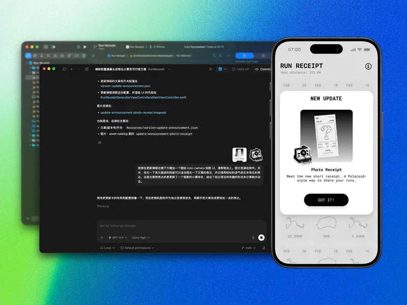
A lot of users told me that for daily 10K runs, or even 30K and beyond, the full receipt gets too long. They want a format that fits in a single screen. That’s something I wouldn’t have anticipated before shipping; when you’re designing, you default to the format you had in mind. But hearing that feedback made me realize this is a real user need, and the receipt needs to support it.
So I’m working on a Polaroid-style variant: a compact, single-screen receipt that you can pair with a selfie. You hold the receipt, snap a photo, and it comes out as this instant-photography-meets-data-visualization thing. The receipt metaphor combined with a Polaroid feel should be pretty fun. It’s the kind of feature you only think of after seeing how users actually use the app, and that’s been the most interesting part of the whole process.
Download Run Receipt from App Store / Follow Huang Ji on Twitter
黄冀是一名产品与视觉设计师。几年前开始跑步,一路跑到了全马 3 小时 24 分。跑着跑着,他开始想象一个纯粹围绕愉悦感设计的跑步工具会是什么样子。但他从未写过一行代码。凭借 AI 工具和设计师的直觉,他发布了 Run Receipt:一款把跑步数据变成热敏小票的 App。我们和他聊了聊跑步、造物,以及做一件小而美的事情的快乐。
Q:先从跑步聊起吧,你是怎么开始跑步的?
几年前突然意识到身体在走下坡路。每天对着电脑,点外卖,一坐就起不来,突然就胖了十斤。你会意识到需要找一个能长期坚持的习惯来激活身体。刚开始在健身房跑跑步机,半小时也就三四公里,非常吃力。
真正的转变是开始到外面跑。观察到公园里早上、晚上都有人在跑,有一天就自己出去了,没戴耳机,绕着家附近的小公园跑了一圈。身边有大爷大妈也在运动,那种社区式的健康氛围特别能激励人,感觉这不是在「锻炼」,而是一种生活方式。慢慢地就从 5 公里推到 10 公里,再到半马。第一次跑完半马,后面两天直接感冒了,免疫力下降得非常快。第一次跑全马更惨,第二天第三天下楼梯基本是扶着墙走的。但身体会适应,现在全马 PB 是 3 小时 24 分,半马 1 小时 29 分。坚持了两年半的时候,运气好抽中了东京马拉松,全世界各种语言都在喊加油的那种场面,太震撼了。
现在每周跑四到五次,请了教练帮我看数据、做训练计划:两次有氧、两次速度训练、周末一次 25 公里以上的长距离慢跑,主要是提升心肺和有氧利用率。跑步对我来说已经不只是锻炼,而是一种系统性的训练。
Q:跑了这么多,怎么会想到要自己做一个 App?
作为产品设计师,我每天都在和各种 App 打交道,所以对理想中的跑步工具自然有一个画面:简洁、轻量,拿起来就用、放下就走,没有负担。我觉得运动数据是很私人的东西,你可以选择分享到任何社交平台,但工具本身应该保持安静和专注。
分享其实是人的一种底层社交需求。有这种意愿的人,希望通过不同的形式来表达自己,而不是每个人都用一样的模板。我一直喜欢小而美的产品,也一直想尝试给数字产品做一种更有叙述感的品牌,不只是功能的容器,而是有自己性格和视觉语言的东西。所以最初的想法其实更大:做一个有品牌个性的跑步 App,让分享这件事本身就能带来不一样的感觉。
Q:为什么想到用小票这种形式?
做设计的时候探索过其他形式,比如路线图海报、配速照片拼图,这些 Strava 和国内的 App 都在做,是比较成熟的路径了。如果要让产品有自己的风格,就需要引入新的理念。
我平时很喜欢看字体排版、海报设计这些平面的东西。小票吸引我的地方在于它有一种天然的物理感,它是真实世界里一个有严格排版结构的物件,但承载的内容很日常。把跑步数据放进去,就产生了一种有趣的张力:熟悉的超市小票格式,但里面是你的配速、心率、海拔。当然,运动数据和购物清单的结构完全不同,怎么把分段训练、心率曲线、配速趋势这些东西自然地映射到小票的排版里,是花了不少设计功夫的。最终出来的东西不是真的纸,但让你觉得它有真实物件的质感。有用户问我能不能连热敏打印机把它打出来。完全可以,买个三十多块的打印机,连上一打就出来了。
Q:你之前完全没写过代码,这个 App 是怎么做出来的?
先从静态页面开始,把运动数据按小票的排版逻辑做了一轮梳理。然后拿到 Google AI Studio 里搭了个网页版的 Demo,上传 GPX 文件,生成小票。AI 还原出来的效果还真不错,虽然那时候还比较简单,没有现在的海拔图、心率曲线这些,但足够验证这个概念是成立的。
然后就想:能不能直接做到真正的手机上?于是用 Codex 来写原生 iOS App。第一个版本现在想起来特别笨,因为网页版是上传文件的逻辑,我就让 iOS 版也从手机文件系统里选 GPX 文件。这大概就是完全没有开发经验的人会犯的错:你在网页上没办法读手机的健康数据,所以就默认 iOS 上也得这样。后来才反应过来,完全可以直接读 Apple Health。当所有历史跑步记录一下子出现在屏幕上的那一刻,真的特别开心。为什么之前要让人去翻文件管理器?
从网页原型到上架 App Store,大概一个月。网页实验是过年前后开始的,到三月中旬就上线了。对一个完全没有开发经验的人来说,这个速度太可怕了。我觉得关键是进去之前你要有清晰的产品想法。AI 负责实现,但你得知道自己在做什么、为什么做。
Q:Run Receipt 的设计理念是什么?
小而美。路径要短,体验要专注。与其增加复杂性,不如增加趣味性。小票的格式、字体排版、那些小细节,都是为了让你看到自己的跑步数据时能感受到点什么,而不是塞更多功能进去。这个 App 不需要什么都做,它只需要做好一件事,并且让这件事是真正让人享受的。
其实我还在跟朋友一起做一个更完整的跑步 App,涉及训练分析和 AI 指导。Run Receipt 最初是从那个大项目的分享功能里独立出来的,因为这个想法本身就足够独立。而且两个产品的节奏不一样:主 App 是长期的训练伙伴,而 Run Receipt 是即时的。跑完步,打一张小票,想分享就分享。这种即时感恰恰是它成立的原因。
Q:接下来有什么计划?
很多用户反馈说,日常跑个 10 公里、甚至 30公里以上时,完整的小票太长了,希望能有一屏就能看完的小票形式。这是上线之前没有想到的,自己设计的时候,会默认选择自己设想的形式来制作。但听到这个反馈之后发现,小票需要有这样的支持,这是用户的真实需求。
所以,我在做一个拍立得风格的变体:紧凑的单屏小票,可以配合自拍一起用。拿着小票拍一张照,打出来就是一个即时摄影加数据可视化的东西。小票的隐喻加上拍立得的感觉,应该会挺有趣。这种功能只有在看到用户真正怎么使用之后才会想到,这也是整个过程里最有意思的部分。
下载 Run Receipt / 关注黄冀的 Twitter