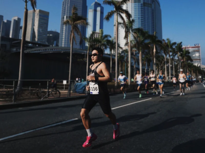
Huang Ji is a product and visual designer who picked up running a few years ago and never stopped, all the way to a 3:24 full marathon. Along the way, he started imagining what a running app could feel like if it were designed purely around delight. He’d never written a line of code, but using AI tools and his design instincts, he shipped Run Receipt, an app that turns your workout stats into a beautifully typeset thermal receipt. We sat down with him to talk about running, building, and the joy of making something small and personal.
Q: Let’s start from the beginning. How did you get into running?
A few years ago I realized my body was heading downhill. I’d been sitting at a desk all day, ordering takeout, barely moving. I gained about five kilos almost overnight and knew I needed a physical habit to pull myself out of it. I started with 30-minute jogs at the gym, maybe 3 or 4 kilometers. It was genuinely hard at first.
The shift happened when I started running outdoors. I’d noticed people running in parks at all hours, mornings and evenings, and one day I went out without headphones, just jogging around a small park near home. There were older folks exercising, people of all ages doing their thing, and something about that communal energy clicked. It felt like a lifestyle, not a workout. I gradually moved all my running outside and started pushing further: 5K, then 10K, then half marathons. My first half marathon left me sick for two days afterward; your immune system just crashes. My first full marathon was even harder. I could barely walk down stairs for three days, practically holding the wall. But your body adapts. Now my full marathon PB is 3 hours 24 minutes, and my half is about 1:29. Two and a half years in, I got lucky and drew a spot in the Tokyo Marathon. Running through streets where the crowd is cheering in every language on earth, that was something else entirely.
These days I train four to five times a week with a coach: two easy aerobic runs, two speed sessions focused on pace capacity, and a long run on the weekend, usually 25 kilometers or more at a relaxed effort, mainly for building cardiopulmonary endurance. Running has become a real discipline for me, not just exercise.
Q: So with all that running, what made you feel like you needed to build your own app?
As a product designer, I interact with apps all day, so I naturally had a picture of what I wanted a running tool to feel like: clean, lightweight, something you pick up and put down with zero friction. I also believe running data is deeply personal. You should be able to share it wherever you want, on any social platform, but the tool itself should stay quiet and focused.
Sharing is a fundamental human impulse, a basic social need. People who have that desire want to express themselves through different forms, not just the same template everyone else uses. I’ve always been drawn to products that are small and beautiful, and I wanted to build something with a strong sense of brand, a distinct visual personality and narrative. As someone who works in product and visual design, I felt like digital products deserve that same kind of identity that you see in good physical branding. So it started as a bigger vision: a running app with its own character, where the sharing experience could feel genuinely different.
Q: Why the receipt format? That’s a pretty unexpected metaphor for running data.
I explored other formats first: route map posters, photos with pace and distance overlaid. Those are well-trodden paths. If I wanted the product to have its own identity, I needed a concept that felt fresh.
I spend a lot of time looking at typefaces, poster layouts, and graphic design in general. A receipt caught my attention because it has this wonderful physicality. It’s a real-world artifact with a very strict typographic structure, but the content is completely mundane. Swapping in running data felt like an interesting tension: the familiar format of a grocery store receipt, but carrying something personal and meaningful. Of course, running data and shopping items have very different structures, so there was real design work in figuring out how splits, heart rate curves, elevation profiles, and pace trends could map onto that format in a way that felt natural rather than forced. It’s not a real piece of paper, but it feels like one. Some users have even asked if they can connect a thermal printer and print them out, and they absolutely can. A 30-yuan printer, connect it, and the receipt image prints right out.
Q: You’d never written code before Run Receipt. How did you actually build it?
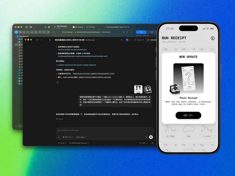
I started by laying out the receipt design statically, figuring out what running data maps to which “line items” on a receipt. Then I brought that into Google AI Studio and built a web prototype where you could upload a GPX file and it would generate a receipt. The AI did a surprisingly good job reproducing the layout. At that stage it was still pretty basic, just the top-level stats without elevation charts or heart rate curves, but it was enough to validate the concept.
Then I thought: why not take this to a real phone? I used Codex to help me write a native iOS app. My first version was hilariously naive. Because the web prototype worked by uploading files, I had the iOS version do the same thing: pick a GPX file from the phone’s file system, then render it. Looking back, it’s a very “no development experience” kind of decision. It didn’t occur to me that I could just read Apple Health data directly until later. That moment, when I made the switch and all my historical runs suddenly appeared on screen, was pure joy. Why was I making people dig through file managers?
The whole journey from web prototype to App Store launch took about a month. The web experiments started around Chinese New Year, and by mid-March it was live. For someone who had never written code, that speed was honestly shocking. I think the key is having a clear product vision going in. AI handles the implementation, but you still need to know exactly what you’re building and why.
Q: What’s your design philosophy for Run Receipt?
I believe in small and beautiful. The path should be short, the experience should be focused. Instead of adding complexity, I’d rather add delight: the receipt format, the typography, the little details. These are about making you feel something when you look at your run, not about cramming in more features. The app shouldn’t need to do everything; it should do one thing and make that one thing genuinely enjoyable.
There’s actually a bigger running app I’m building with a friend that covers training analysis, AI coaching, the full picture. Run Receipt originally started as the sharing component of that larger project, but the idea felt strong enough to stand on its own. Splitting it out also made sense because the two products serve different rhythms: the main app is a long-term companion, while Run Receipt is an instant, immediate thing. You finish a run, you get your receipt, you share it if you want. That immediacy is what makes it work.
Q: Any hints about what’s next?
A lot of users told me that for daily 10K runs, or even 30K and beyond, the full receipt gets too long. They want a format that fits in a single screen. That’s something I wouldn’t have anticipated before shipping; when you’re designing, you default to the format you had in mind. But hearing that feedback made me realize this is a real user need, and the receipt needs to support it.
So I’m working on a Polaroid-style variant: a compact, single-screen receipt that you can pair with a selfie. You hold the receipt, snap a photo, and it comes out as this instant-photography-meets-data-visualization thing. The receipt metaphor combined with a Polaroid feel should be pretty fun. It’s the kind of feature you only think of after seeing how users actually use the app, and that’s been the most interesting part of the whole process.
Download Run Receipt from App Store / Follow Huang Ji on Twitter