SandBase
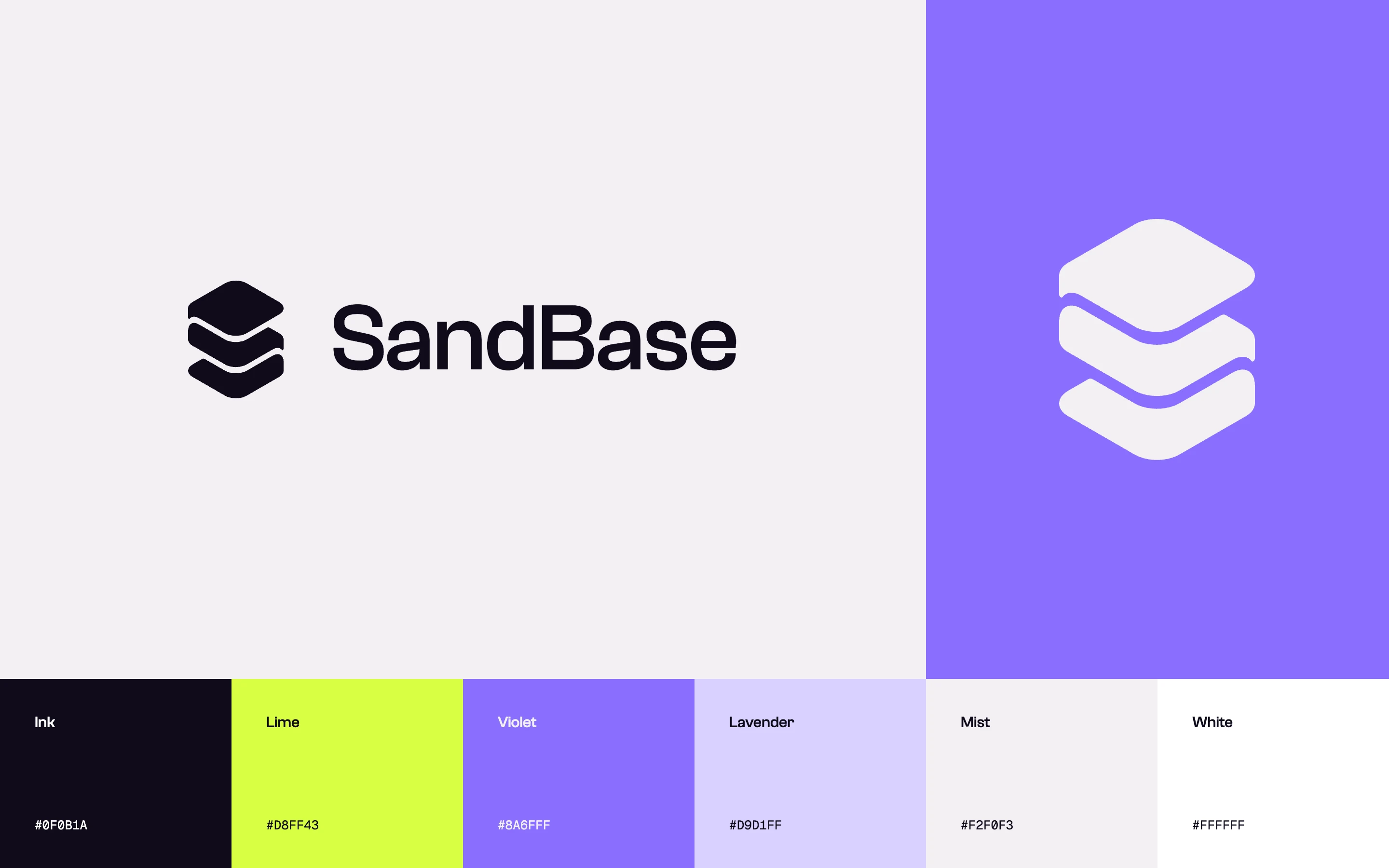
SandBase is a platform that gives agents their capabilities. Models, APIs, skills, and other agents are collected in one place for developers to combine. We designed the identity and the website, and built a set of brand tools the team now uses to produce its own material. A stacked symbol, a small fixed palette, and procedural pixel imagery run through all of it.
Built in layers
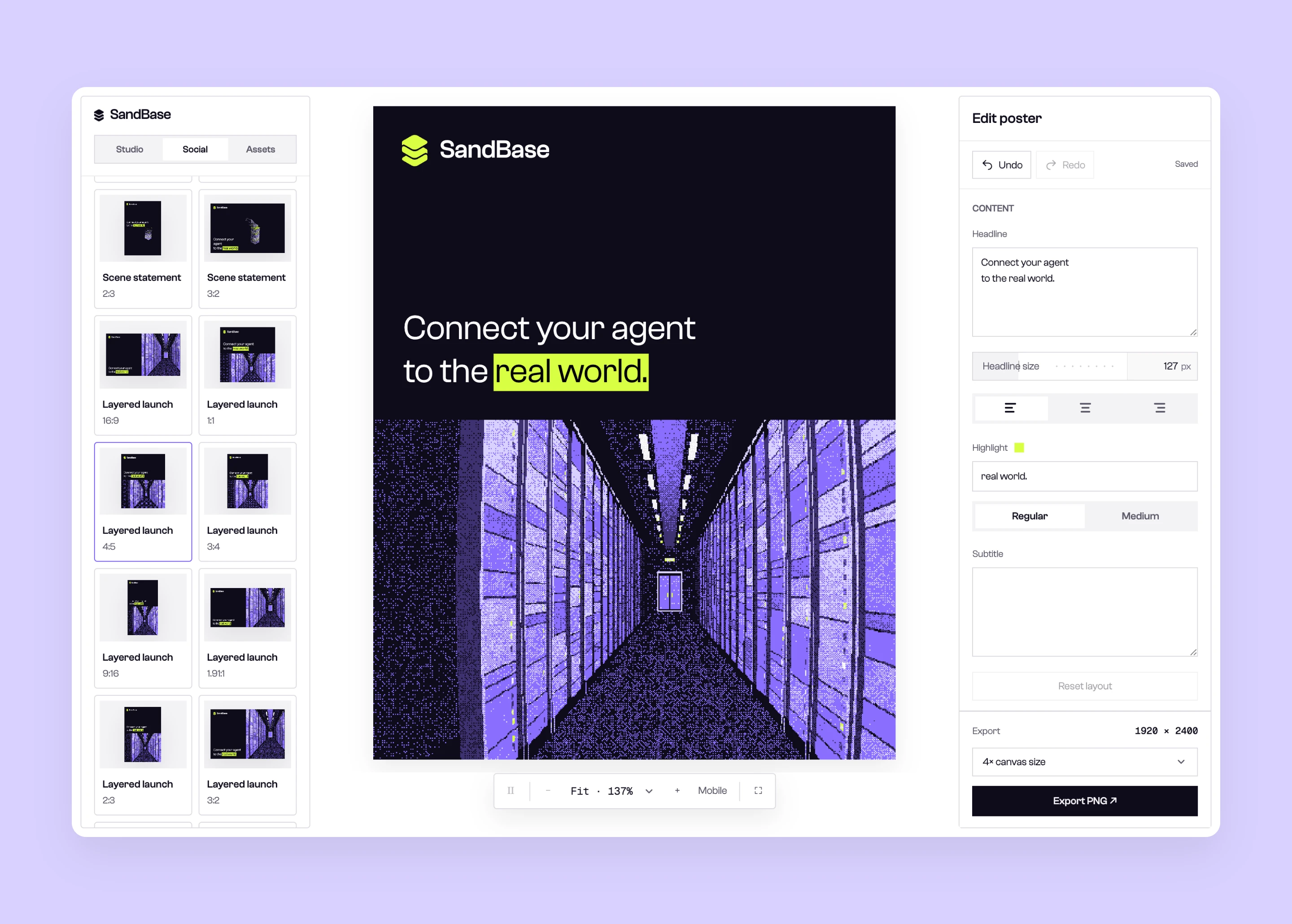
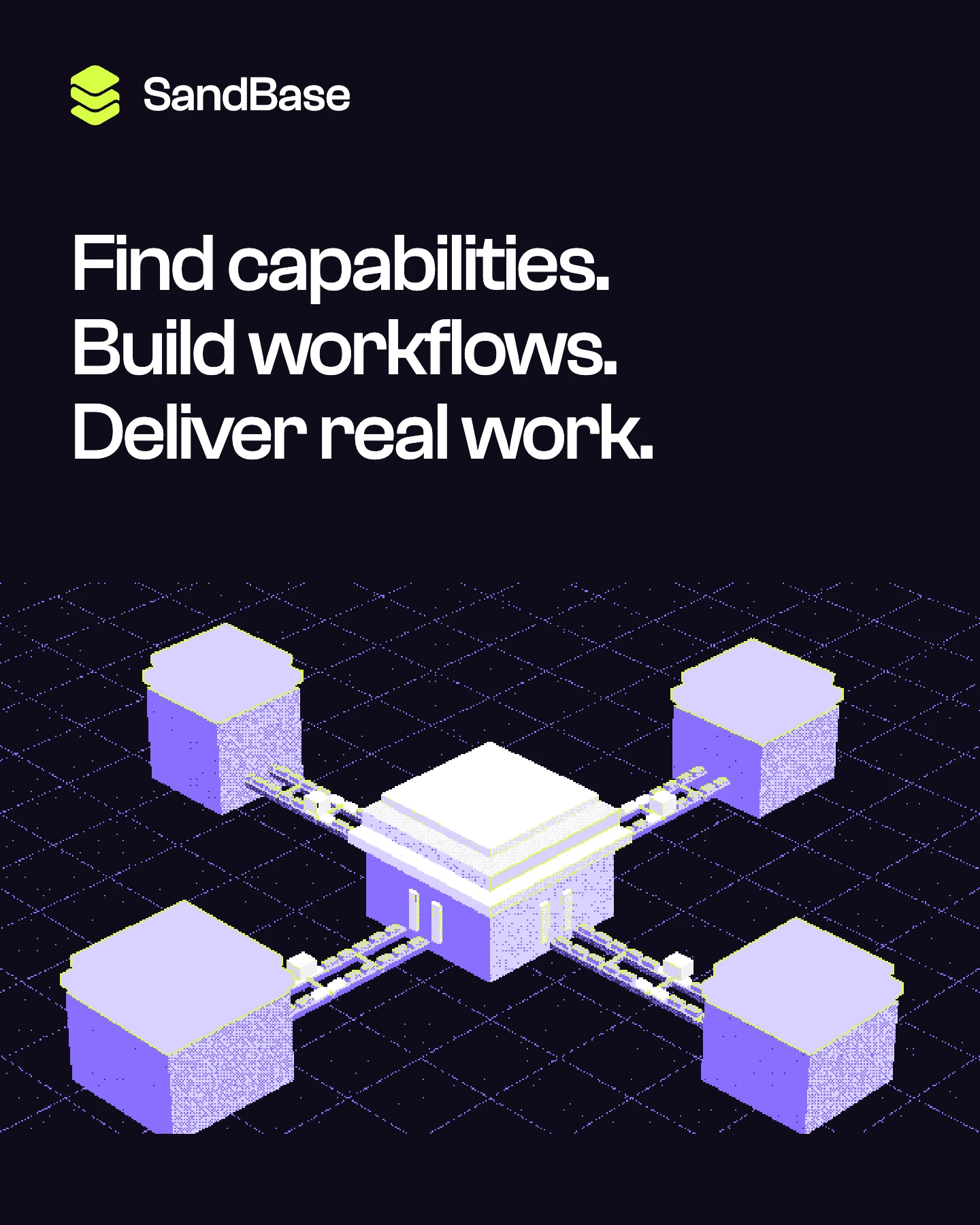
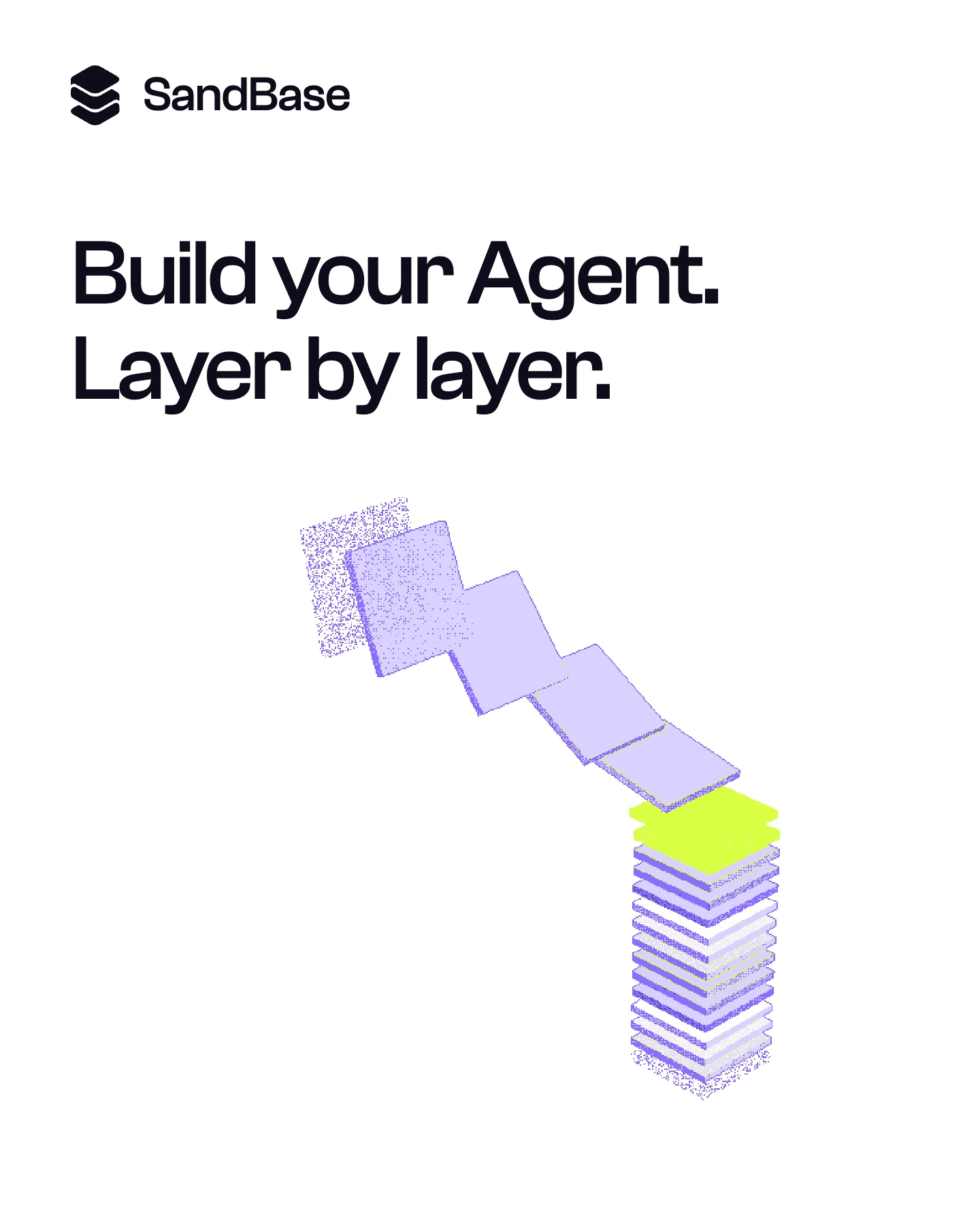
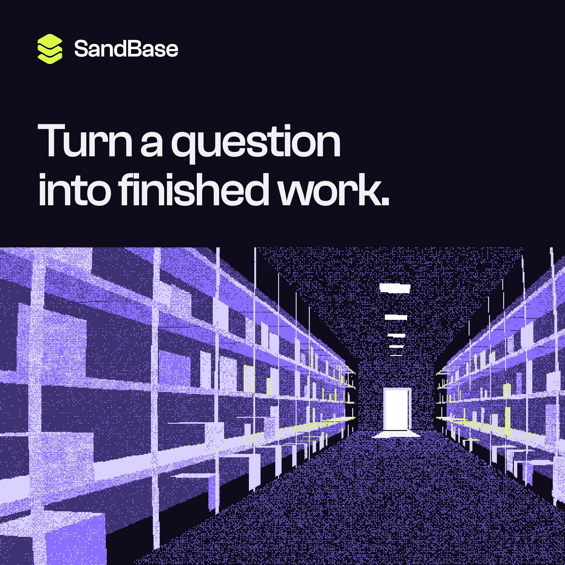
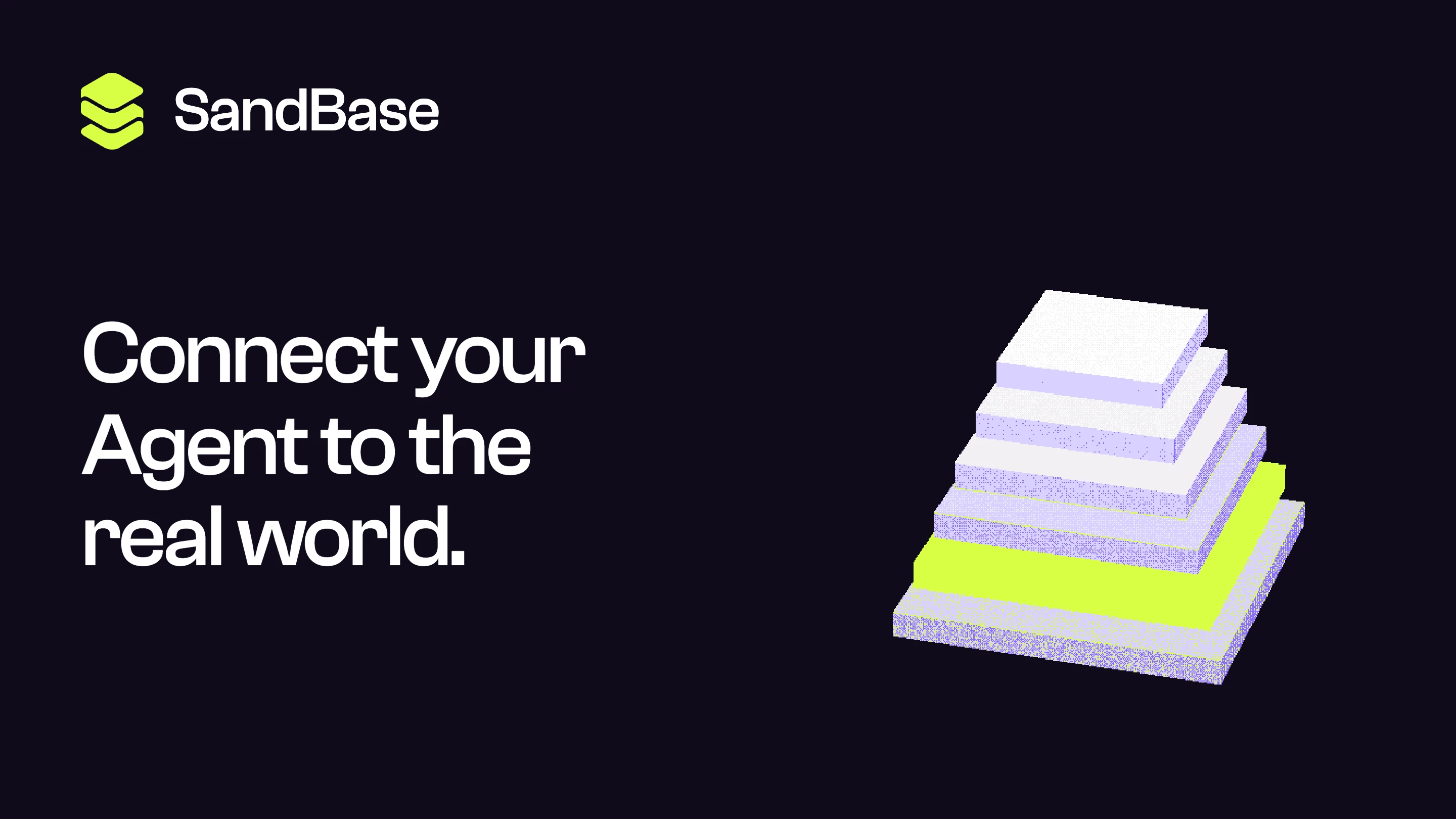
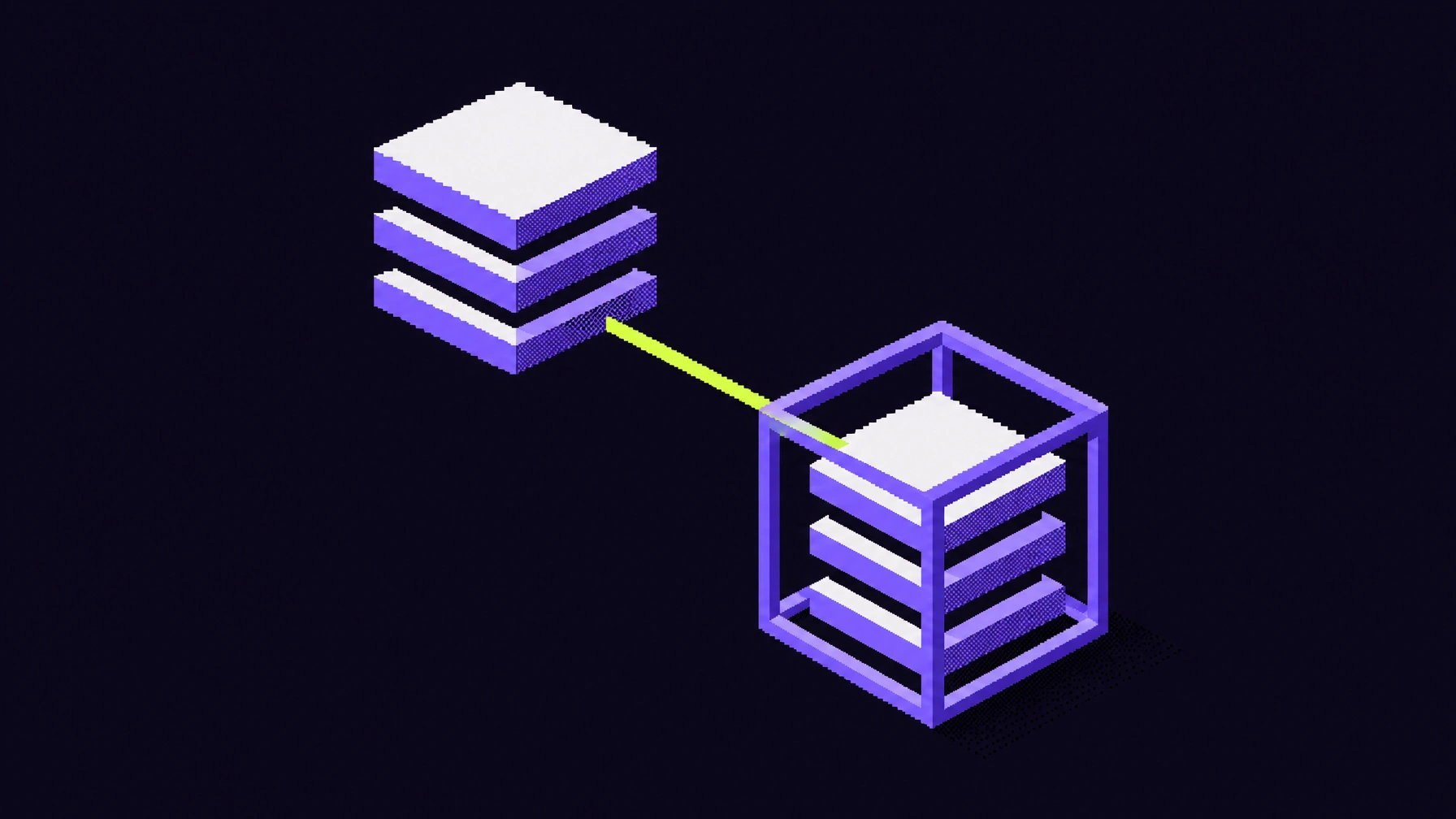
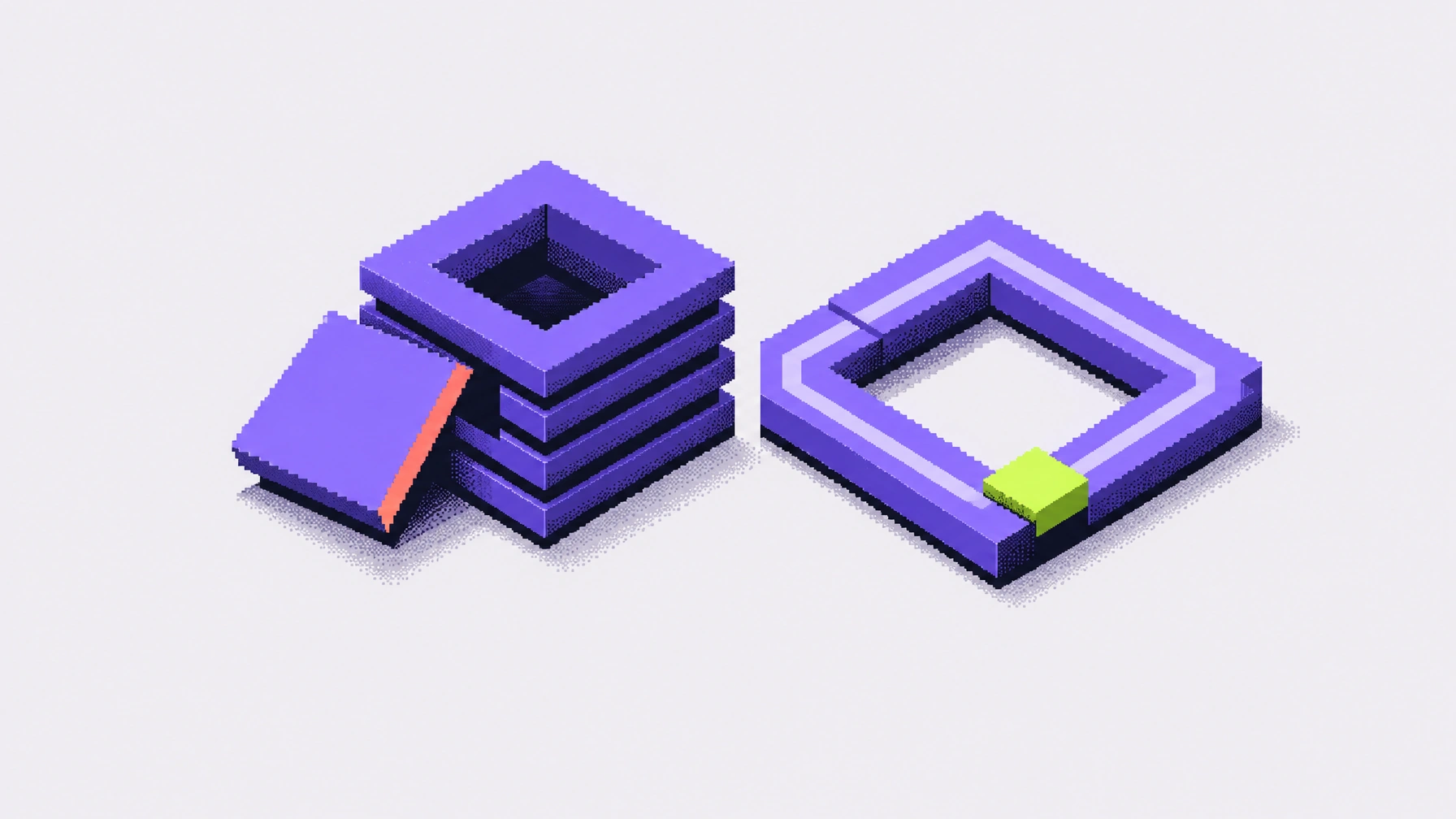
Every capability on SandBase is a unit that combines with others, and the brand starts from one such unit. The symbol is a stack of layers. It is the logo, and it is also the basic building block of the visual system: layers stack, shift, and pass a signal along, the way tools do in a workflow. Agents have no body of their own, so we represented them as servers, then used pixelation to blur the line between servers and skyscrapers. At low resolution a server rack and a high-rise share the same silhouette, so the imagery reads as machines and as a city at once, and a construction aesthetic suggests work under way. Together, this creates the illusion that agents are a workforce operating in the real world.
From the city to the catalog
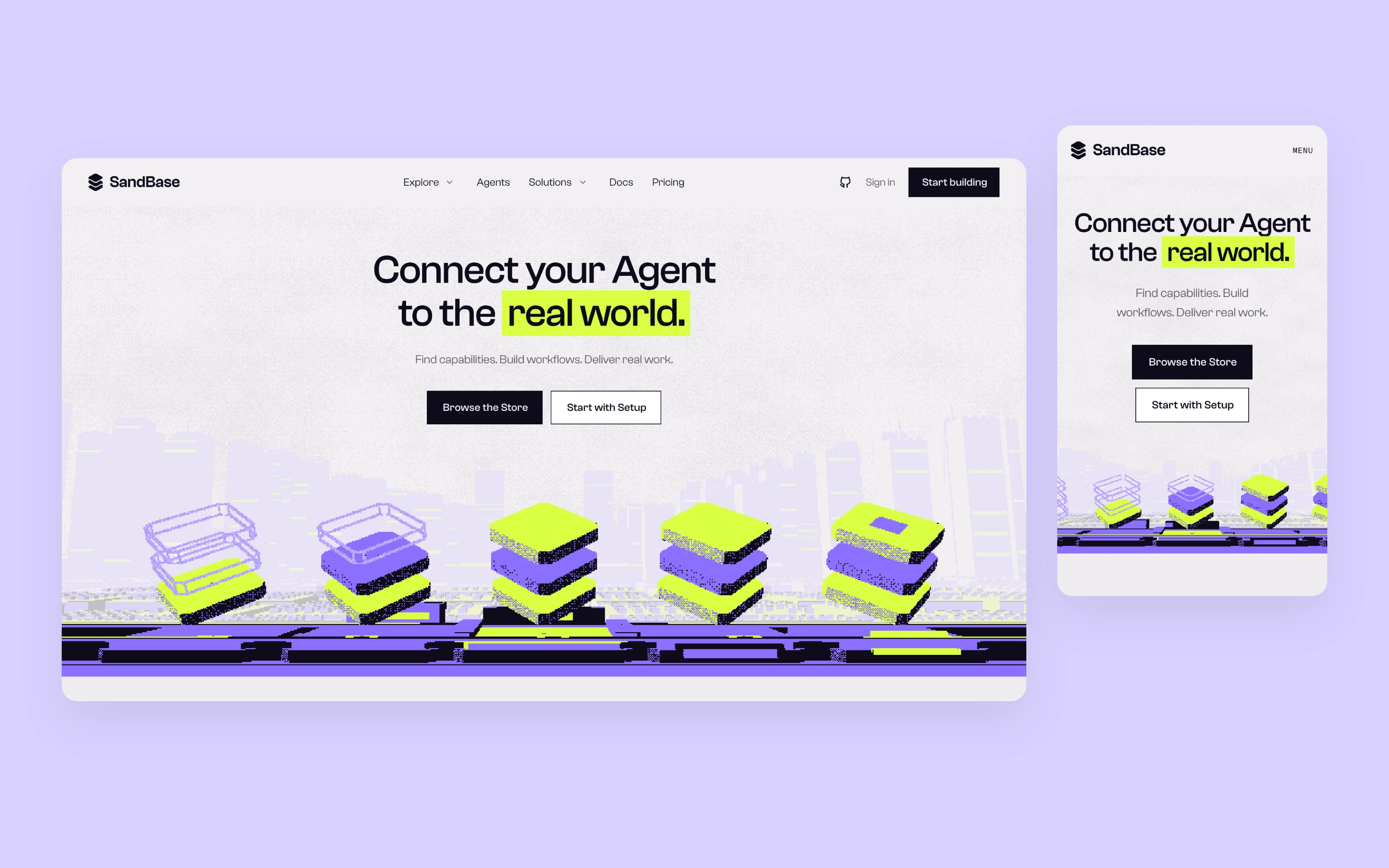
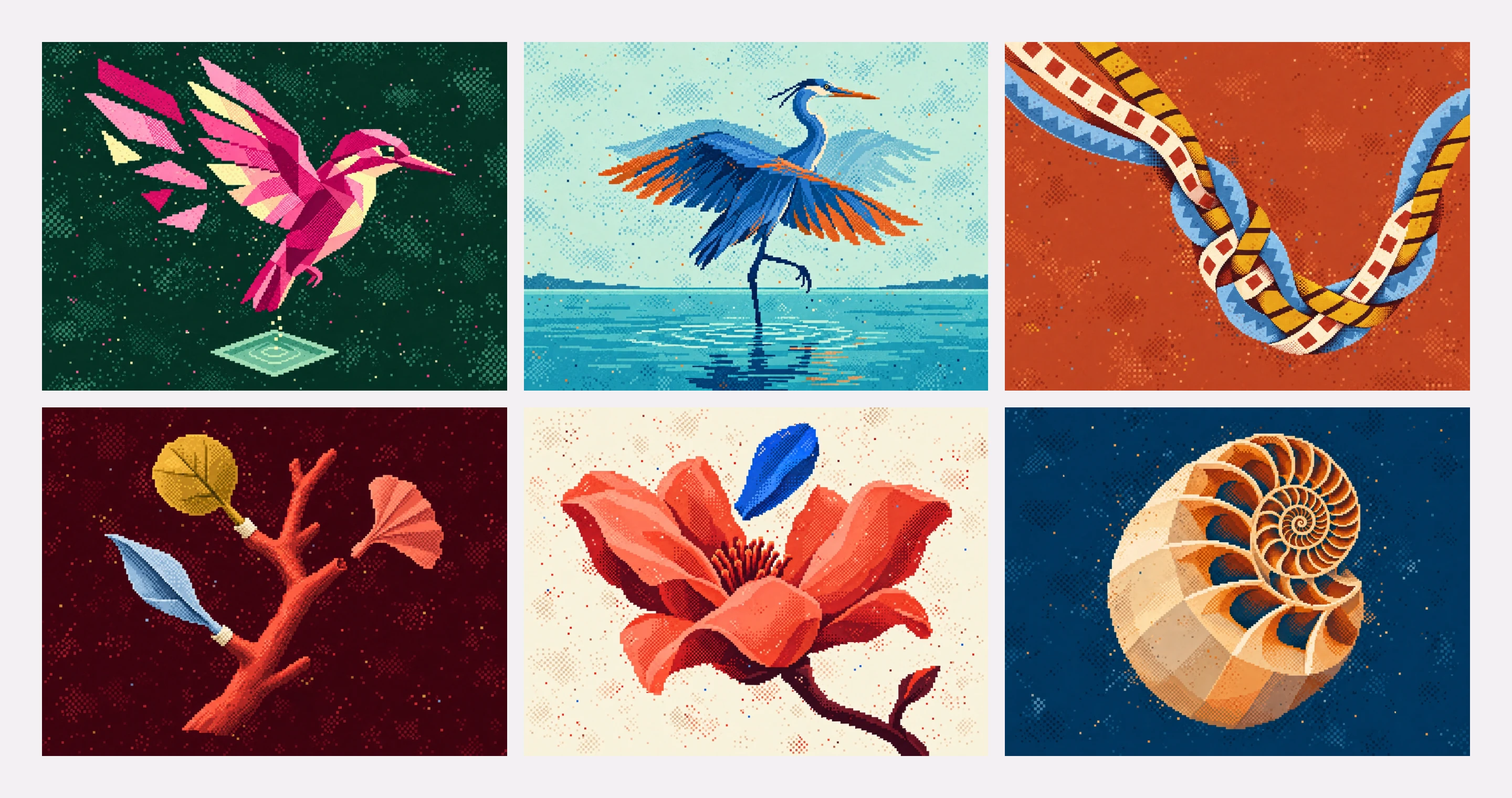
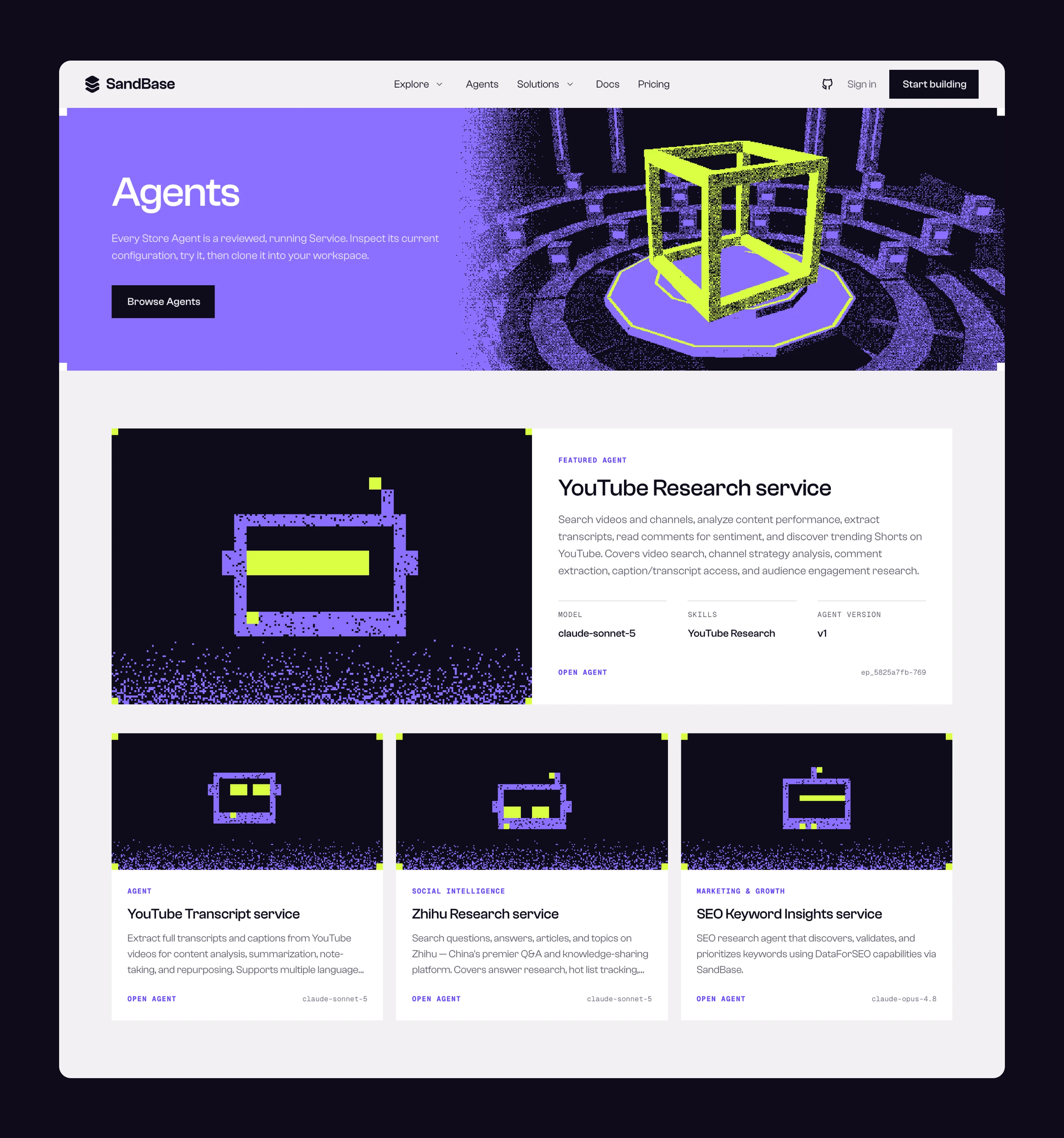
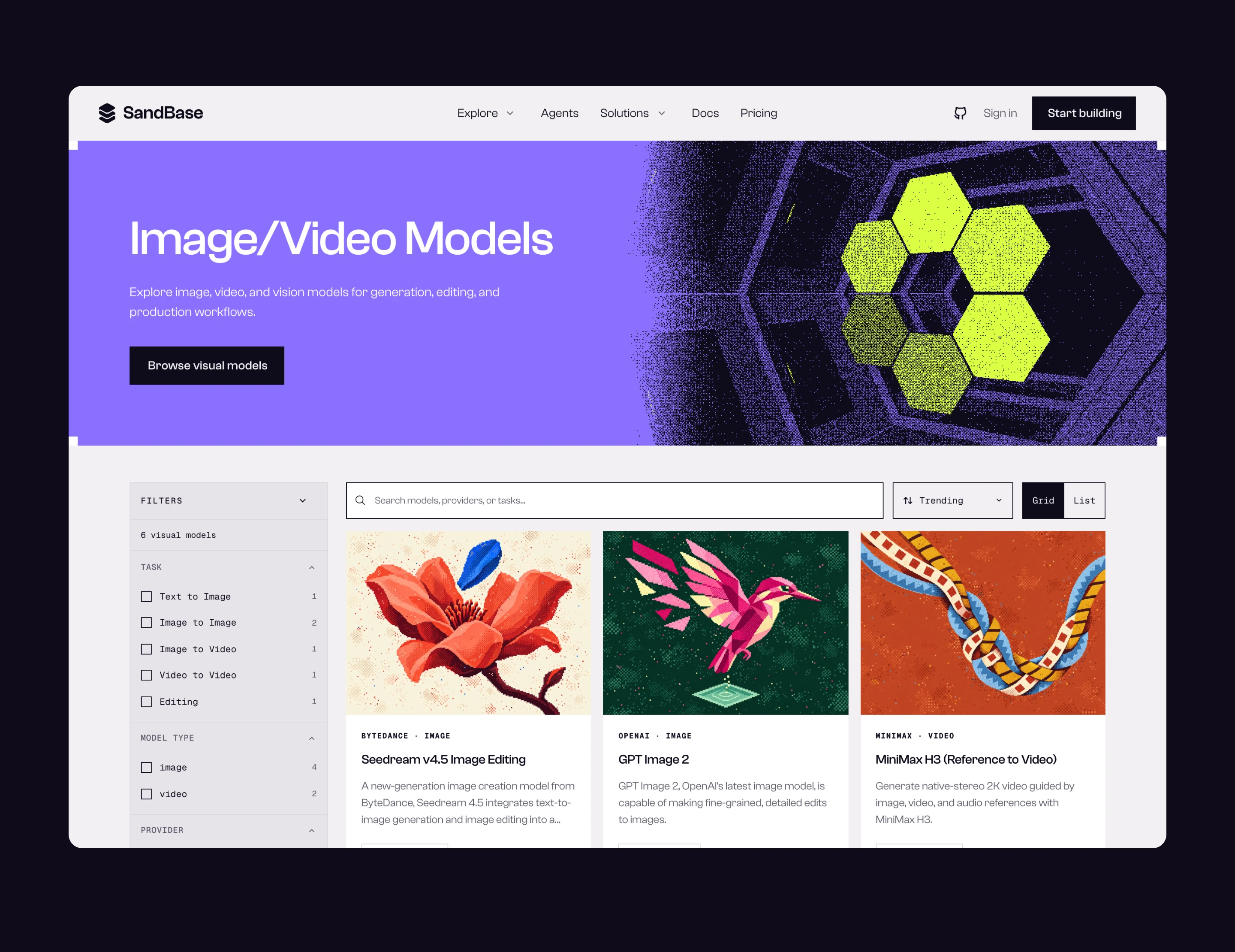
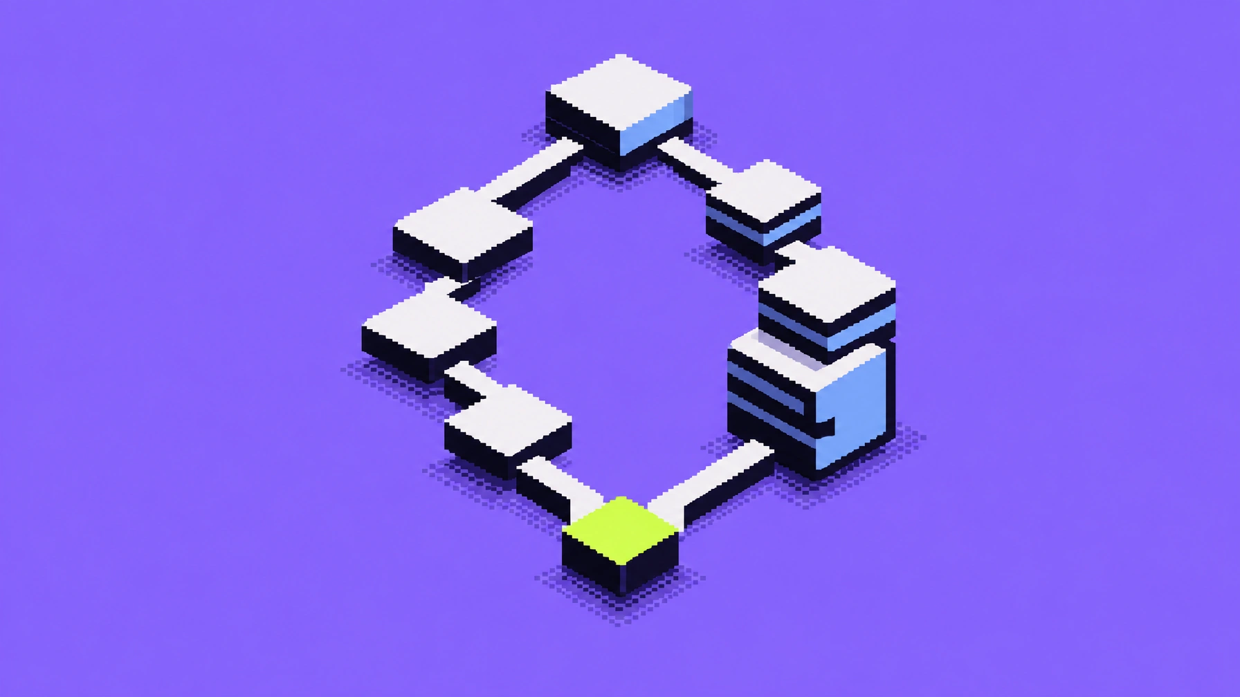
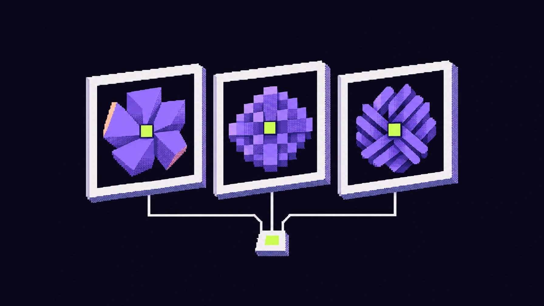
The website moves from atmosphere to function. The homepage opens on the pixel city to establish the brand’s world; in the agent and model catalogs the imagery recedes and the page returns to a clear grid with search and filters, leaving attention for comparing and choosing. Each agent gets a generated pixel mark, so every entry in the catalog has a recognizable face. The model covers are the one exception in the system: they leave the brand palette to illustrate what each model is good at, held together only by the shared pixel texture. Blog covers return to the brand colors and use layered structures to express the technical ideas in each article.
Tools instead of guidelines
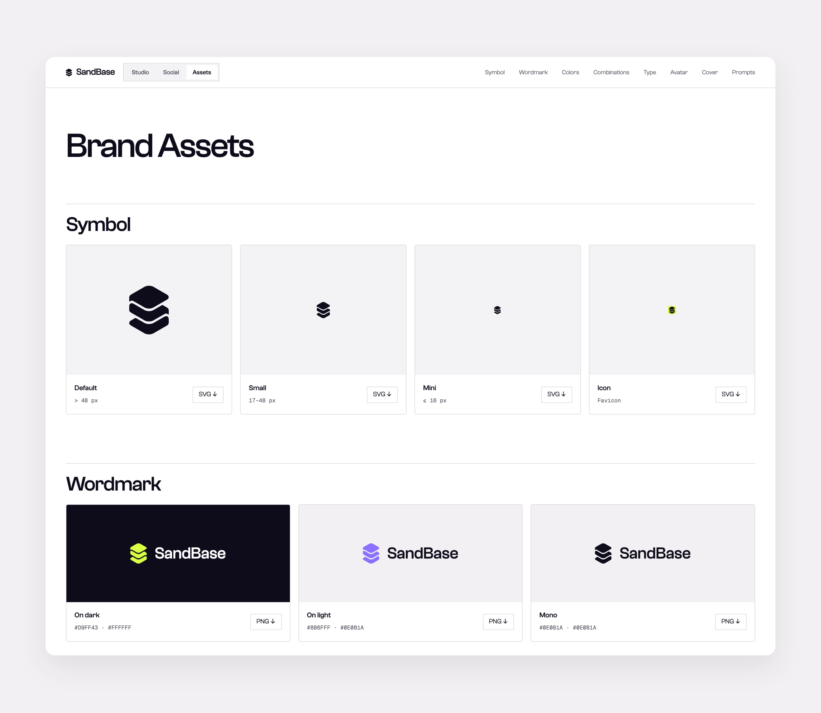
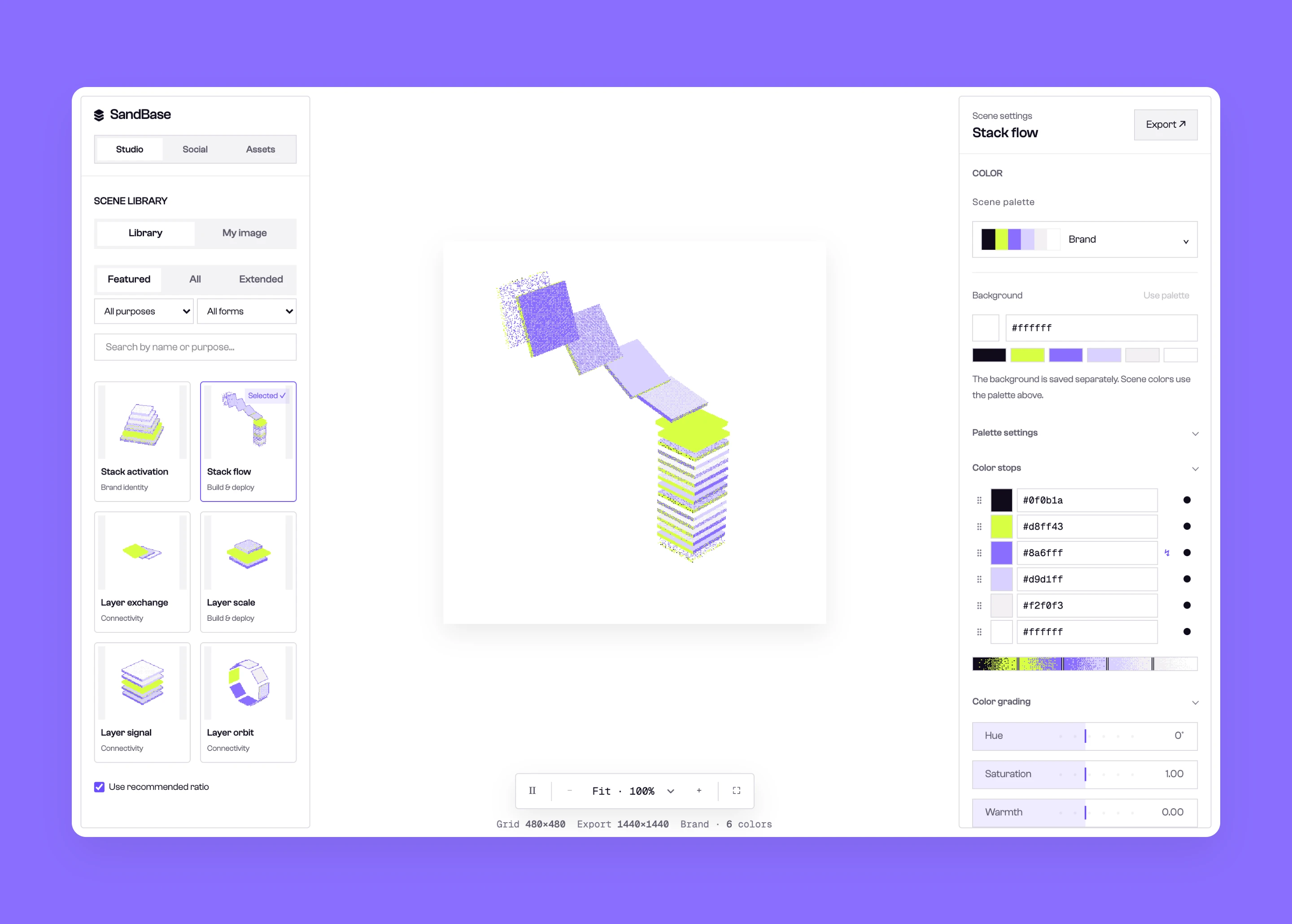
SandBase is built on combining capabilities, and the brand works the same way. Instead of a static guideline document, we made the brand a set of tools: the Studio for imagery and motion, the Social editor for announcements and posts, and the Assets page for logo and cover downloads. All three share one scene library and palette, the same source as every image on this page. When the team needs new material, it comes out of this system, so nothing starts from scratch and the result stays on brand.